Challenge 5: Visualizing the results
Introduction
We can look at the data in BigQuery SQL workbench, but it’s usually better to visualize data using a BI tool. We could use any BI tool for that purpose but for this challenge we’ll use Looker or Looker Studio to achieve that.
Description
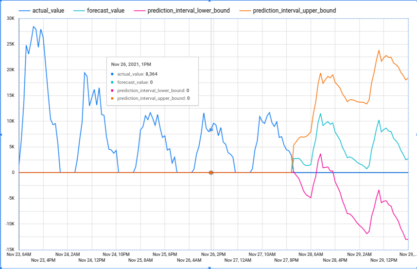
Build a time series chart that displays the forecasts for the product Bag of Organic Bananas, including the lower and upper bounds of the predictions (confidence bands).
See below for an example:

Success Criteria
- There’s a line graph that shows the hourly sales for an individual product and its forecasted sales for the next two days, including the confidence bands